

You have clicked “Accept All” without reading it. You have paid for a subscription you tried to cancel months ago. You have watched a countdown timer that reset the moment you refreshed the page. Every one of those moments is one of the eleven dark patterns covered in this guide, working exactly as designed.
None of that happened by accident. Every one of those moments was a specific, tested piece of interface design, built by a team whose job was to make you choose what benefits the company rather than what benefits you.
These are dark patterns, and they are not a handful of isolated tricks. They are a coordinated design discipline, used across nearly every major app and website you touch in a normal day.
This guide maps out the full territory: consent tricks, subscription traps, manufactured urgency, gamified compulsion, buried settings, manipulated defaults, fake credibility, emotional triggers, financial gamification, and pricing deception. By the end, you will be able to recognise each one on sight, and know exactly where to go for a deeper look at any tactic that matters most to you.
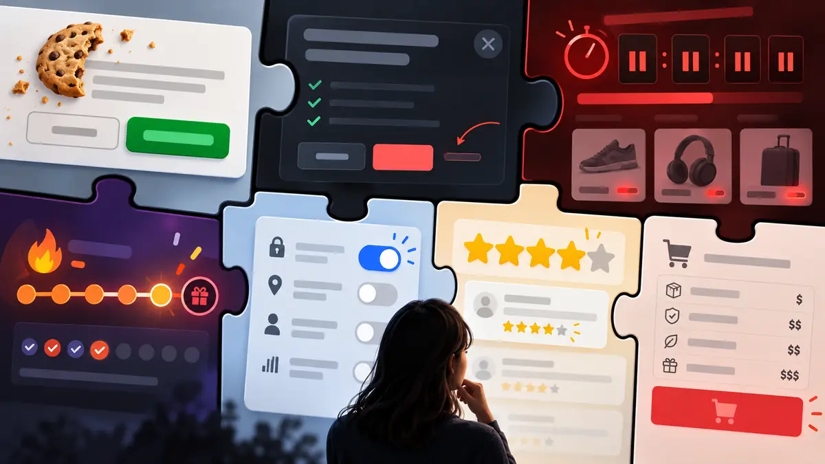
Why Does This Matter More Than Most People Realise?
Each dark pattern looks small on its own. A slightly bigger button. A hidden menu. A countdown that resets.
Individually, none of these feels like a serious problem, which is exactly why they work.
The pattern only becomes visible when you see it repeated across every product you use, tested and refined the same way a scientist tests a hypothesis, kept only when it measurably changes your behaviour in the company’s favour.
The scale of enforcement now underway shows how seriously regulators take this. The US Federal Trade Commission fined Amazon 2.5 billion dollars in 2025, the largest consumer protection penalty in the agency’s history, over a cancellation flow that took four pages and six clicks to complete what sign-up did in one.
Care.com paid 8 million dollars for a nearly identical pattern. These are not edge cases. They are the industry norm, caught.
Every tactic in this guide shares the same underlying logic: friction is removed wherever it benefits the company, and added wherever it benefits you. Once you can see that asymmetry, it stops working on you the same way.
None of the eleven modules below exist in isolation either. A cookie banner trains you to click through consent screens without reading them, which makes a buried privacy setting easier to leave untouched. A subscription’s roach motel cancellation flow relies on the same friction principle as a buried “delete my account” option. Once you notice one pattern, the rest become far easier to spot, because they are all built from the same handful of underlying tricks, reapplied to a different screen.
It also helps to know that dark patterns are not evidence of a single rogue designer having a bad idea. They are typically the result of extensive A/B testing, where a team runs two versions of a screen against real users and keeps whichever version produces more revenue, more time-on-app, or fewer cancellations, regardless of how that version makes the user feel. The dark pattern you encounter has usually already been tested against thousands of people before it ever reached you.
The people building these screens are rarely acting with malicious intent toward you personally. Most are simply optimising for a metric their employer set, session length, conversion rate, retention, without the specific harm to any one user ever appearing in the dashboard they are measured against. That distance between the metric and the person behind it is part of why dark patterns persist even at companies with genuinely well-meaning design teams.
Why Is It So Hard to Say No to a Cookie Banner?
A cookie consent screen looks like a simple yes-or-no question. It rarely is. “Accept All” is usually a bold, colourful button. “Manage Preferences” is smaller, greyer, and sometimes buried a click deeper, a trick question dressed up as a formality.
Confirm shaming pushes this further, wording the decline option to make refusal feel like a bad decision rather than a neutral one. Some sites go as far as a consent wall, refusing to load content at all until you agree.
Read the full guide: Cookie Banners and Consent Tricks: How Apps Get You to Say Yes
Why Is Cancelling Always Harder Than Signing Up?
Free trials ask for card details before you have used the product, which quietly removes the one moment you might have said no. When the trial ends, billing continues by default, with no prominent reminder.
This is the roach motel pattern: easy to enter, deliberately difficult to leave. Cancellation is often routed through a separate website, a support ticket, or a multi-step retention flow designed to interrupt you before you finish.
Retention flows add a psychological layer on top of the structural friction: a discount offer, a guilt-based message about what you will lose, or a fake “are you sure” screen that reframes cancelling as a mistake rather than a routine choice.
Read the full guide: Subscription Traps: Why You’re Paying for Things You Never Wanted

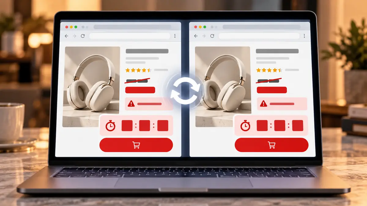
Is That Countdown Timer Actually Real?
Refresh a shopping page and watch the countdown reset. That alone tells you the deadline was never tied to anything genuine. “Only 2 left in stock” behaves the same way, generated algorithmically rather than pulled from real inventory.
Urgency works because it short-circuits careful thinking, the same mechanism scam callers use when they tell you to act immediately. A crossed-out “original price” adds a second layer, anchoring your sense of value to a number that may never have been real.
Read the full guide: That Countdown Timer Is Fake, How Urgency and Scarcity Trick You
Why Can’t You Stop Checking the Streak?
A streak counter has no function beyond existing, yet losing it triggers real discomfort. That is loss aversion, deliberately calibrated so a meaningless number feels like something worth protecting.
Variable rewards add unpredictability borrowed directly from slot machines. Multiple US states sued Roblox in 2025 alleging its streaks, virtual currency, and reward mechanics were built specifically to exploit children’s developmental psychology for spending and retention.
Read the full guide: Why You Can’t Stop the Streak: How Apps Use Gamification Against You

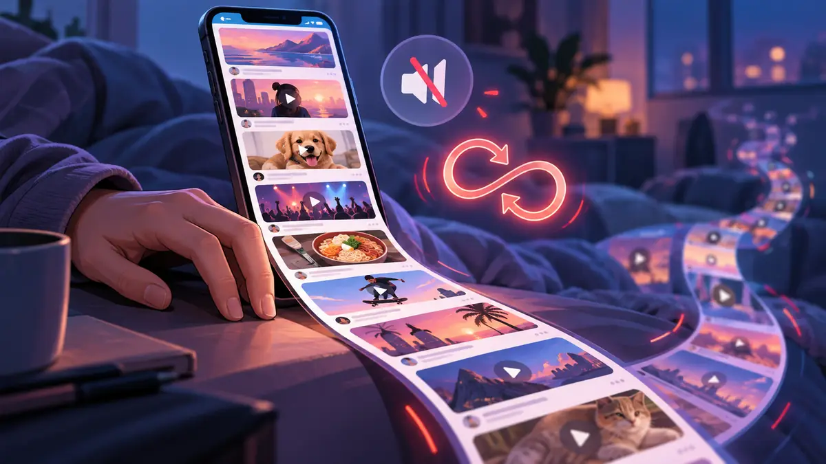
Why Do You Lose Track of Time in a Feed?
Older websites had a “next page” button, a natural pause. Infinite scroll removed it, and autoplay removed the pause between videos too, so content simply continues until you consciously intervene.
Meta’s own internal research found that removing these stopping points increased average session length by twenty to thirty minutes a day, a result kept even after it was linked to rising anxiety in teenage users.
Read the full guide: Infinite Scroll Was Designed to Keep You Watching
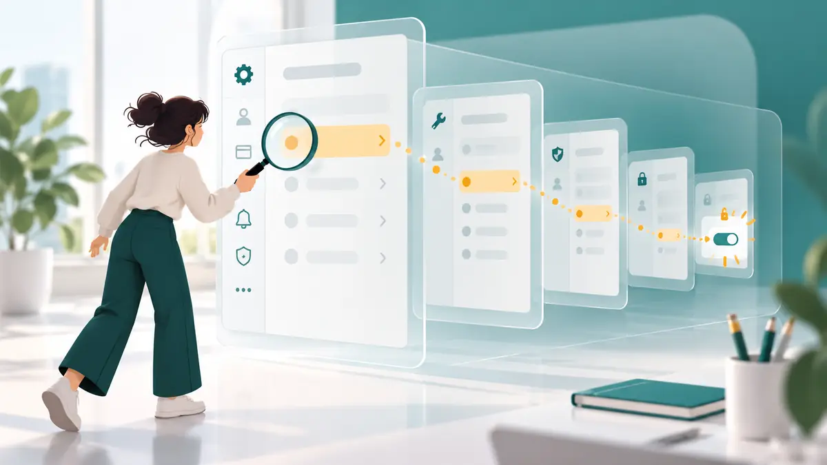
Why Can You Never Find the Setting You Actually Need?
An audit of major platforms found the most privacy-protective settings buried five to seven menus deep, while data-sharing options sat on the very first screen. That gap is consistent across otherwise unrelated products because it serves the same purpose everywhere.
Vague labelling compounds the problem: a control named “Manage my experience” rarely tells you what it actually does until you have already tapped in.
Read the full guide: Hidden in Plain Sight: How Apps Bury the Settings You Actually Need
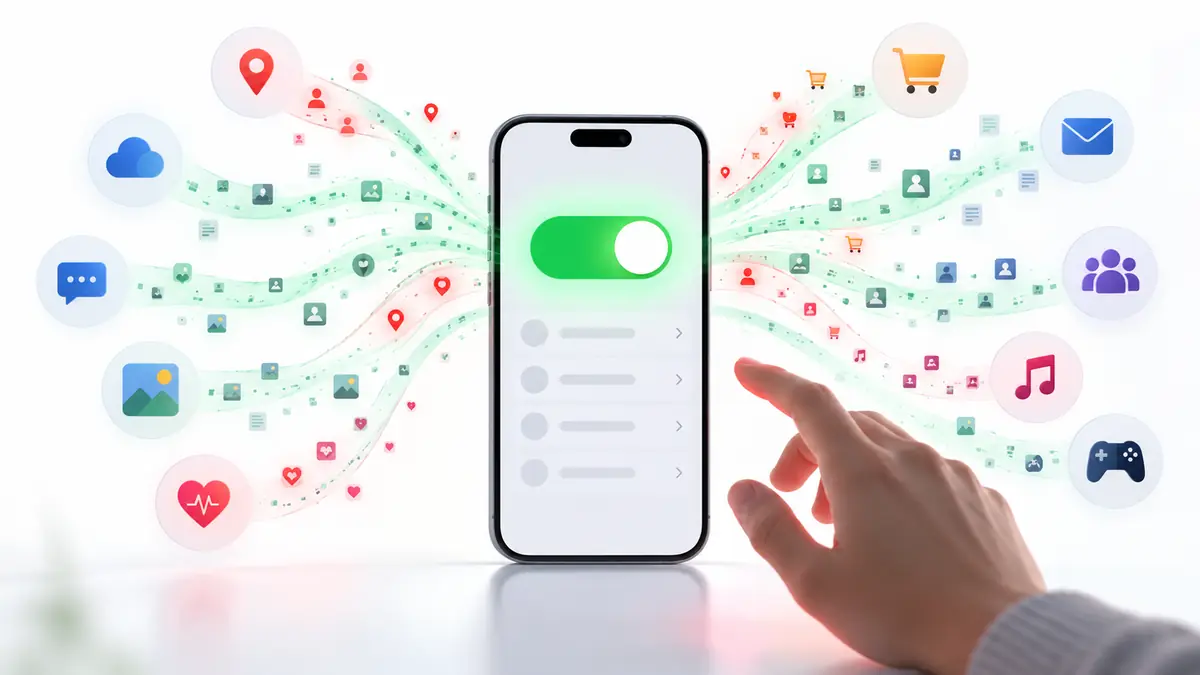
Why Do Your Apps Share More Than You Realise?
Most people never touch a default setting after install, and platforms design defaults knowing exactly that. Opt-out, rather than opt-in, means the majority of users end up sharing data they never consciously agreed to.
The FTC found major platforms collecting data even on people who had never created an account at all, through tracking pixels on unrelated third-party sites, entirely without any opt-in step.
Read the full guide: The Default Setting Problem: Why Your Apps Share More Than You Think
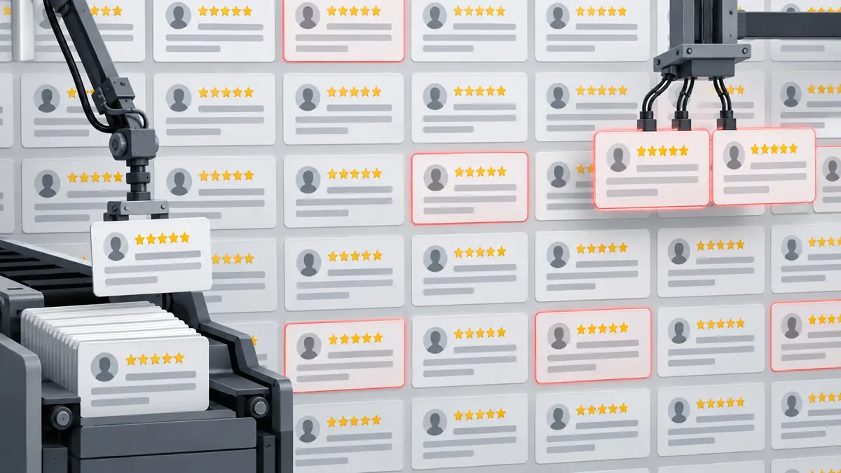
Are the Reviews You’re Reading Even Real?
An estimated 30 to 40% of online reviews on major shopping platforms are fake or incentivised. Paid review farms and bot accounts inflate ratings at scale, while a “Verified Purchase” badge only confirms a transaction happened, not that the review is honest.
The FTC’s fake reviews rule took effect in October 2024, with its first enforcement actions arriving in 2025 against companies caught paying for manufactured five-star ratings.
Read the full guide: Are Those Reviews Real? How Fake Social Proof Works Online
Why Do Notifications Make You Feel a Certain Way on Purpose?
The red badge on an app icon, the specific vibration pattern, the colour of a warning: none of it is decorative. Each element is tested for the emotional response it produces, then kept because it increases how often you check.
A New Mexico jury ordered Meta to pay 375 million dollars in March 2026, the first major verdict finding that notification design and dopamine-triggering interactions were deliberately engineered to create dependency in teenage users.
Read the full guide: How App Design Triggers Your Emotions to Keep You Engaged.

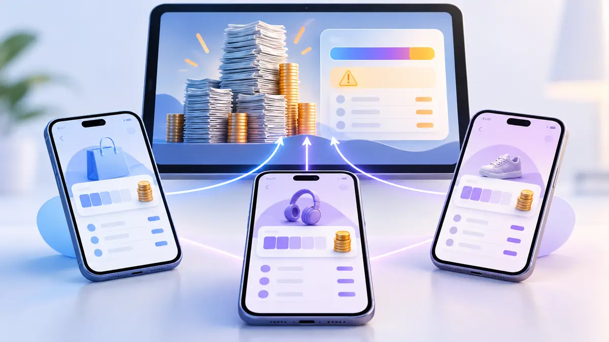
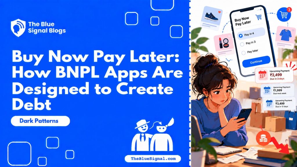
Is “Pay in 4” Actually a Payment Feature?
Buy Now, Pay Later feels like a convenience at checkout. It is a credit product, and because each provider only shows its own balance, debt can accumulate invisibly across three or four separate apps at once.
The US Consumer Financial Protection Bureau moved in 2025 to classify BNPL under the same rules as credit cards, following documented cases of consumers unable to see their combined total across providers.
Read the full guide: Buy Now, Pay Later: How BNPL Apps Are Designed to Create Debt.
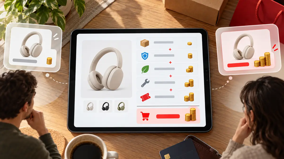
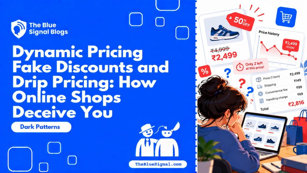
Is Everyone Really Paying the Same Price You Are?
Two people, same product, same moment, different prices, based purely on device, location, and browsing history. Drip pricing adds a second layer, revealing fees only at the final checkout screen after you have already invested time deciding.
The UK’s Competition and Markets Authority estimated drip pricing costs consumers roughly 2.2 billion pounds a year, and opened formal investigations into major ticketing and travel platforms in 2025.
Read the full guide: Dynamic Pricing, Fake Discounts and Drip Pricing.
For further reading across this section, the Deceptive Design pattern library, the FTC’s guidance on dark patterns, the UK CMA’s research on online choice architecture each offer additional depth.
Frequently Asked Questions
Are dark patterns illegal?
Many specific tactics are, depending on the country. GDPR in the EU, the FTC Act and ROSCA in the US, and India’s DPDP Act all cover aspects of consent manipulation, subscription traps, and misleading pricing, though enforcement varies significantly by jurisdiction.
How do I know if a design I’m seeing is a dark pattern?
Ask whether the path that benefits the company has less friction than the path that benefits you. If saying yes takes one tap and saying no takes several, that asymmetry is almost always deliberate.
Where should I start if I want to protect myself right now?
Start with whichever module in this guide matched something you recognised while reading. Fixing one buried setting or cancelling one forgotten subscription today builds the habit of noticing the same pattern the next time it appears elsewhere.
Can reporting a dark pattern actually change anything?
Yes, more than most people assume. Regulators like the FTC and the UK’s CMA rely heavily on consumer complaints to identify which patterns are widespread enough to justify formal investigation, and several of the enforcement actions covered in this guide began exactly that way.
Dark patterns are not eleven unrelated tricks. They are one design philosophy, applied consistently: make the profitable choice effortless, and make the protective choice cost something in time or attention.
Once you can name the pattern, it loses most of its power over you. Start with the one tactic from this guide that felt most familiar, and go read that module next.
Naming a pattern out loud, even just to yourself in the moment, is a surprisingly effective countermeasure. Saying “this is a roach motel” or “this urgency is fake” while looking at the screen interrupts the exact automatic response the design was built to produce, which is often enough on its own to restore a genuine choice.
None of this means avoiding apps and websites altogether, which is neither realistic nor necessary. It means approaching each screen with the same working assumption a careful shopper brings to a sales floor: the layout was designed to benefit the seller first, and a genuinely good deal will still look good after you have taken the extra few seconds to check.
If this was useful, share it with someone who needs to know.


8 comments
Comments are closed.